Orlando City unveils new crest ahead of jump to MLS
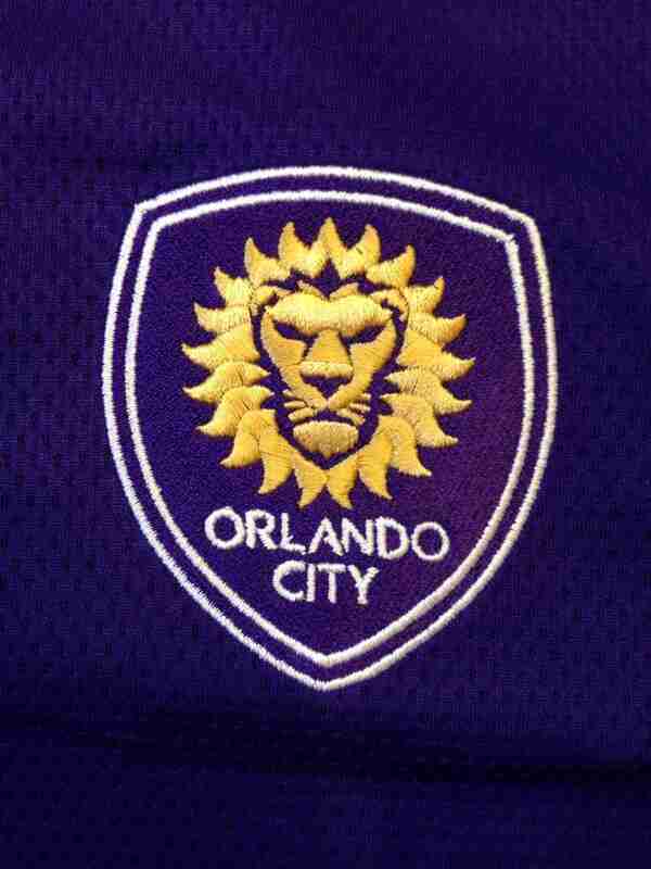
Orlando City’s new crest features 21 sun flares to represent the club being the 21st team in the MLS.
May 13, 2014
Orlando City SC made another landmark unveiling on their way to the MLS in 2015, when they revealed their new crest via social media on Tuesday.
The new crest features a single lion head, as oppose to the old three lion logo, with the lion’s mane consisting of 21 sun flares to represent both Orlando City being the 21st MLS club, while also paying homage to the Sunshine State.
“I think it’s really, really nice,” said forward Dennis Chin about the new crest. “I think it represents the city well, it’s classy, it’s a clean look. I think they did it very well.”
Players and fans alike seem to like the new logo, which has a new-age feel, while still looking like an American soccer crest. Some may be skeptical and say that it looks a lot less European than the last crest, but the club is making the jump to the MLS after all.
“It’s a little bit different from a lot of badges within the league,” said Orlando City manager Adrian Heath. “But for me it’s just another exciting moment. We’re just that one step closer to MLS and it’s something that the club had been really working hard on.”
One notable reaction to the new crest is that is is obviously without any stars, which usually represent championships, but players and coaches both hope to change that.
“The stars gone, but we’re going to have to get a new star on that pretty soon.” said defender Bryan Burke. “Other than that I think it looks pretty cool.”
Another notable change to the crest is that the lion is topped with a crown, which is something the players like.
“I personally really like the logo, I think it’s really nice how it uses the sun as the lion’s mane, I like how it incorporates the 21 for us becoming the 21st franchise and I really like the crown.” said defender Tommy Redding, an Oviedo native. “I think it’s a really nice logo and it represents Orlando really well.”
With Orlando City officially rolling out their new crest for the MLS, it’s only a matter of time before they begin breaking the big news, which will be breaking ground on the new stadium.
Only time will tell when Orlando City’s new stadium will begin construction, but one thing is for sure, the organization as a whole is ready to the jump to MLS.
“The fact that our crest is going to be on the MLS website everyday just makes it seem more real,” said Heath. “We’re closer to the dream which we had a few years ago, which is just around the corner now.”
Merchandise with Orlando City’s new logo is already available on their website and will also be available at games throughout the season, starting with Wednesday’s U.S. Open Cup game at the Seminole Soccer Complex.